Learning Analytics: Is Underrepresented Students Group Performing Well?
1. Learning Analytics
Learning analytics is a computational approach analyzing large-sized students’ learning and education data. It became pretty much popular as the online learning and digitized school administrative platforms produce an infinite stream of students’ data daily. Many higher education institutions actively seek learning analytics to promote data-driven decision-making and evidence-based institutional innovation to enhance students’ performance, retention, and administrative efficiency.
2. Example Data Analysis
This post will analyze students’ academic achievement data to see whether the underrepresented student group is performing well enough compared with the other majority group across the time and subject area. The data was artificially and randomly created based on the preconfigured parameter distribution.
2.1. Explorative Data Analysis
2.1.1 Visual Investigation: Histogram
UG represents the Underrepresented Group with 1, and non-UG is the other majority students with 0. MATHs means the math subjects with 1 and non-math subjects with 0. In the histogram below, the y-axis means the number of student count, and the x-axis means GPA. The upper histogram is the students’ distribution in the non-math subject area, and the bottom histogram is that in the math subject area. The blue and red dotted line in the middle of the histogram indicates the mean GPA score of UG and non-UG group students. This figure provides us a glimpse of that first; there is a clear gap between UG and non-UG students across all subject areas. However, it is also indicative that the gap has been slightly narrower in the math subjects.
### UG vs. Non.UG student performance mean

UG_mean<-Overall_Comp %>% group_by(STDNT_GROUP3,MATHs) %>%
  summarise(mean=mean(GRD_PTS_PER_UNIT))

### Histogram Visualization
  ggplot(Overall_Comp, aes(x=GRD_PTS_PER_UNIT)) +
  geom_histogram(aes(fill=STDNT_GROUP3),position="dodge", bins=40, binwidth = 0.3)+
    facet_grid(rows = vars(MATHs), labeller = label_both) +
  labs(title="GPA Distribution", x="GPA", y="Count") +
  theme_minimal() +
  geom_vline(data=filter(UG_mean, MATHs==0), aes(xintercept=mean),
             color=c("red","blue"),linetype="dashed",size=0.8) +
  geom_vline(data=filter(UG_mean, MATHs==1), aes(xintercept=mean),
             color=c("red","blue"),linetype="dashed",size=0.8) +
  scale_fill_manual(name="UG",labels = c("Non-UG", "UG"),values = c("#FFCB05", "#00274C")) +
    theme(plot.title = element_text(size=14, face="bold.italic"),
          axis.title.x = element_text(size=14, face="bold"),
          axis.title.y = element_text(size=14, face="bold"),
          axis.text.x = element_text(size=10, face="bold"),
          axis.text.y = element_text(size=10, face="bold"))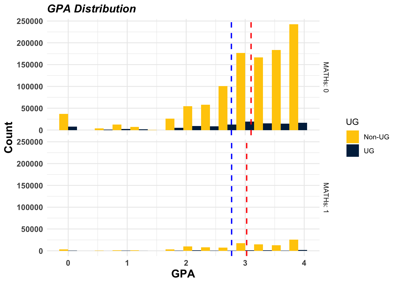
2.1.2 Visual Investigation: Time Series Change
The graph below shows how UG and non-UG students’ average GPA score changes across the term period. In the non-math courses the gap has been maintained while the gap has been continuously narrowed in the math courses. (Yey! It is excellent news to raise equitable future STEM workforce.)
# Time series trend analysis
Term_TS_UG<-Overall_Comp %>%
  select(TERM,Term.Descr,STDNT_GROUP3,GRD_PTS_PER_UNIT, MATHs) %>%
  group_by(TERM,Term.Descr,STDNT_GROUP3, MATHs) %>%
  summarise(mean=mean(GRD_PTS_PER_UNIT))

ggplot(Term_TS_UG, aes(x=TERM, y=mean, group=STDNT_GROUP3))+
  scale_x_discrete(labels = unique(Term_TS_UG$Term.Descr))+
  scale_color_manual(name="UG",labels = c("Non-UG", "UG"),values = c("#FFCB05", "#00274C")) +
  theme_minimal() +
  geom_smooth(method=loess,aes(color=STDNT_GROUP3), size=1) +
  facet_grid(rows = vars(MATHs), labeller = label_both) +
  theme(axis.text.x = element_text(angle = 90, vjust = 0.5, size=8),
        plot.title = element_text(size=14, face="bold.italic"),
        axis.title.x = element_text(size=14, face="bold"),
        axis.title.y = element_text(size=14, face="bold"),
        axis.text.y = element_text(size=10, face="bold")) +
  labs(title="GPA Change Across Terms", x="Term", y="GPA Mean") +
  lims(y=c(2,4))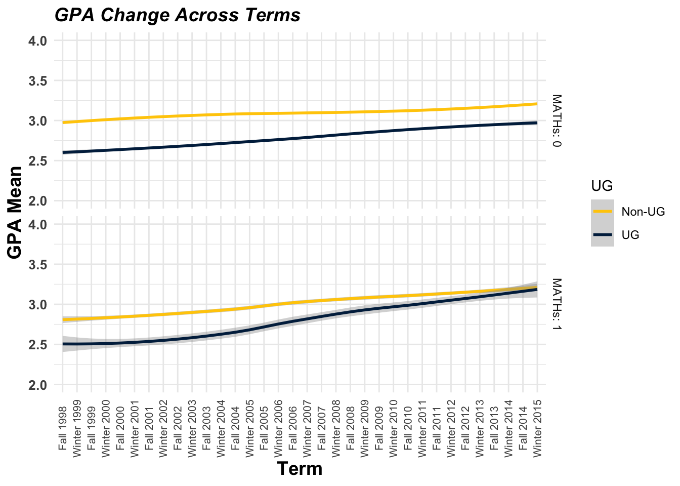
2.1.3 Visual Investigation: Interaction
I checked the interaction effect between UG membership and taking math classes. If there is a clear interaction, we should spot line-crossing or apparent convergence between the two lines. Here, the result is a bit unclear. We cannot estimate whether there is an interaction or not with this picture.
# Interaction plot between CSP membership and Physics class
ggplot(Overall_Comp, aes(x=MATHs, y=GRD_PTS_PER_UNIT,
                         group=STDNT_GROUP3,color=STDNT_GROUP3)) +
  stat_summary(fun = mean, geom = "point") +
  stat_summary(fun = mean, geom = "line") +
  scale_color_manual(name="UG",labels = c("Non-UG", "UG"),values = c("darkred", "#00274C")) +
  theme_classic2() +
  ylim(y=c(0,4))+
  labs(title="Interaction between Maths and UG", x="Maths", y="GPA Mean") +
    theme(axis.text.x = element_text(size=14, face="bold"),
          plot.title = element_text(size=14, face="bold.italic"),
          axis.title.x = element_text(size=14, face="bold"),
          axis.title.y = element_text(size=14, face="bold"),
          axis.text.y = element_text(size=14, face="bold"))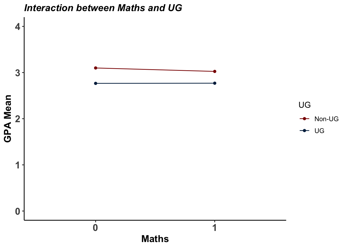
2.2. Linear Multiple Regression
2.2.1 Simplistic Model
Then, I ran the regression. First, I made up the simplistic model, just adding UG-membership (STDNT_GROUP3) and math class (MATHs) as independent variables. The result shows that the UG-membership tends to be negatively associated with students’ GPA score and this relationship is statistically significant. It also explains that the students taking math classes tend to score less compared to their counterparts in the other subject classes. It is also statistically significant.
LM2<-lm(GRD_PTS_PER_UNIT ~ STDNT_GROUP3 + MATHs, data=Overall_Comp)
summary(LM2)
##
## Call:
## lm(formula = GRD_PTS_PER_UNIT ~ STDNT_GROUP3 + MATHs, data = Overall_Comp)
##
## Residuals:
## Min 1Q Median 3Q Max
## -3.0988 -0.3988 0.2012 0.6012 1.2978
##
## Coefficients:
## Estimate Std. Error t value Pr(>|t|)
## (Intercept) 3.0988039 0.0008969 3454.92 <2e-16 ***
## STDNT_GROUP31 -0.3280914 0.0027967 -117.31 <2e-16 ***
## MATHs1 -0.0685440 0.0028988 -23.65 <2e-16 ***
## ---
## Signif. codes: 0 '***' 0.001 '**' 0.01 '*' 0.05 '.' 0.1 ' ' 1
##
## Residual standard error: 0.9308 on 1296733 degrees of freedom
## Multiple R-squared: 0.01084, Adjusted R-squared: 0.01084
## F-statistic: 7106 on 2 and 1296733 DF, p-value: < 2.2e-162.2.2 All Possible Confounders Counted
Then, I added other predictors in our regression model because sometimes the statistical significance in the basic model diminishes due to the other predictors. Although the coefficient score has been slightly decreased, the negative association between GPA and UG-membership and GPA scores and math classes is statistically significant. Also, it indicates male students tend to score lower compared with female students. HSGPA means the high school GPA score, and it is positively associated with their university GPA score. GPAO is the GPA score in the other classes so far in the university. It shows a solid association with the current GPA score. However, it was revealed no interaction effect between UG-membership and math classes, though it has a negative coefficient. It means that underrepresented group students taking math classes do not under- nor outperform another student group.
LM6<-lm(GRD_PTS_PER_UNIT ~ STDNT_GROUP3 + MATHs + SEX + HSGPA + GPAO +
        STDNT_GROUP3:MATHs, data=Overall_Comp)
summary(LM6)
##
## Call:
## lm(formula = GRD_PTS_PER_UNIT ~ STDNT_GROUP3 + MATHs + SEX +
## HSGPA + GPAO + STDNT_GROUP3:MATHs, data = Overall_Comp)
##
## Residuals:
## Min 1Q Median 3Q Max
## -3.9002 -0.3140 0.1327 0.4534 3.9119
##
## Coefficients:
## Estimate Std. Error t value Pr(>|t|)
## (Intercept) -0.2396423 0.0047388 -50.570 <2e-16 ***
## STDNT_GROUP31 -0.1131594 0.0024416 -46.346 <2e-16 ***
## MATHs1 -0.0240013 0.0025247 -9.507 <2e-16 ***
## SEXM -0.0206531 0.0013716 -15.058 <2e-16 ***
## HSGPA 0.0346540 0.0005522 62.761 <2e-16 ***
## GPAO 1.0003087 0.0013613 734.803 <2e-16 ***
## STDNT_GROUP31:MATHs1 -0.0128971 0.0091333 -1.412 0.158
## ---
## Signif. codes: 0 '***' 0.001 '**' 0.01 '*' 0.05 '.' 0.1 ' ' 1
##
## Residual standard error: 0.7773 on 1296729 degrees of freedom
## Multiple R-squared: 0.3103, Adjusted R-squared: 0.3103
## F-statistic: 9.722e+04 on 6 and 1296729 DF, p-value: < 2.2e-162.2.3 Multicollinearity Check
Multicollinearity indicates a degree of association among the independent variables. Once the score exceeds 7 or 9, the model is inefficient because it includes some redundant variables explained by the other independent variables. Fortunately, in this regression model, there is no multicollinearity among the independent variables.
car::vif(LM6)## STDNT_GROUP3 MATHs SEX HSGPA
## 1.093532 1.088315 1.008777 1.011272
## GPAO STDNT_GROUP3:MATHs
## 1.030711 1.1549402.2.4 Coefficient Change Across Time
What if we divide the data set according to their terms and establish regression modeling for each term? Would the coefficients be the same across the time? It is just beyond multiple regression, and it may request multilevel modeling, assuming each students’ score observation is embedded in each term, or we can add term as a categorical independent variable. Also, there is a way to include the interaction between the variables and the term.
However, this may require more complicated data preprocessing and can be felt between multiple regression here. So, I just decided to provide simple visualization, giving us a glimpse of each coefficient’s time-series change. The graphs indicate the coefficient for each term, and the vertical lines indicate confidence intervals. It shows a birds-eye view of the change in coefficients across time.
Although it is not a rigorous statistical method to figure out coefficient change across time, it provides us some great insight that can build up our next model.
The students’ general GPA continuously been improved across the terms as we can see in the intercept graph.
The underrepresented students’ group has improved their academic performance although their score stays lower than the majority students’ group. The graph “STDNT_GROUP3” shows this upward trend very clearly.
The students dramatically reversed the coefficient value from negative to positive for the math class. This means that in the past, students taking math classes got a lower score comparing with the students in the non-math classes, but these days this tendency was reversed.
The high-school GPA (HSGPA) is still a meaningful predictor of the student’s GPA in the university, but its association level is lower than in the past.
There seems to be a seasonal trend in the students’ GPA score, as seen from graphs of Intercept, SEXM, and GPAO.
We can see a constant up and down between fall and winter semester. It may indicate that our model has some missing independent variables in explaining the students’ academic performance.
Stu_Dist<-Overall_Comp %>%
  select(TERM, Term.Descr, MATHs, STDNT_GROUP3) %>%
  group_by(TERM,Term.Descr, MATHs, STDNT_GROUP3) %>%
  summarise(n=n()) %>% ungroup() %>%
  group_by(TERM,Term.Descr,MATHs) %>%
  mutate(prop=n/sum(n)) %>%
  mutate(MATHs=as.factor(MATHs))

# LM Summary by each term

LM_Summary_TERM<-Overall_Comp %>%
  group_by(TERM) %>%
  do(tidy(lm(GRD_PTS_PER_UNIT ~ STDNT_GROUP3 + MATHs + SEX + HSGPA + GPAO + STDNT_GROUP3:MATHs,
             data=.),conf.int = TRUE))

plot_list=list()
for(i in unique(LM_Summary_TERM$term)){
p<-ggplot(filter(LM_Summary_TERM,term==i),
       aes(x=TERM, y=estimate)) +
  scale_x_discrete(labels = unique(Stu_Dist$Term.Descr)) +
  geom_line() +
  geom_point() +
  geom_errorbar(aes(ymax = conf.high, ymin=conf.low), width=0.2) +
  theme_bw() +
  facet_grid(rows="term") +
  theme(axis.text.x = element_text(angle = 45, vjust = 0.5)) +
  geom_vline(aes(xintercept=0),
             color=c("red"),linetype="dashed",size=0.8)
  plot_list[[i]]=p
}

ggarrange(plot_list[[1]],plot_list[[2]],plot_list[[3]],plot_list[[4]],
          plot_list[[5]],plot_list[[6]],plot_list[[7]],
          ncol = 1, nrow = 7)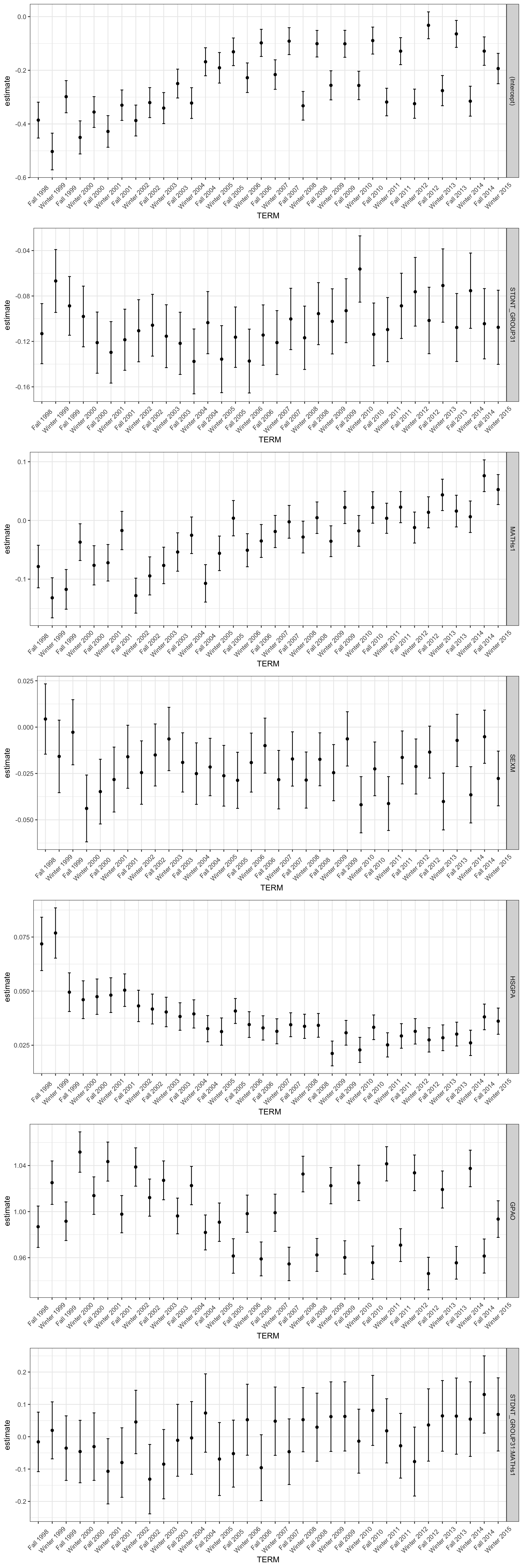
3. Conclusion
In this post, I examined the academic performance of the underrepresented students group comparing with another non-underrepresented students group in all courses and also in the math courses. My analysis discovered that the underrepresented students group tends to score lower both in all classes and math classes, but the performance gap has been narrowed down across the time. Also, the analysis found that the underrepresented students group does not specifically under-perform in the math classes comparing with the other classes.
This information can be crucial to make an institutional level policy decision. Fortunately, the result showed that underrepresented students group is improving their academic performance a lot, and even the influence of high school GPA score has been decrease, which means the students’ learning experience in the university contributed to their GPA score. However, it should be noticed that we may need more rigorous test to prove that the students’ performance has been much improved and the gap has been narrowed down across the time. I will address this problem in another posting.